Thursday, March 24, 2011

Focal Point

In every design it is important to have a focal point.  Something that catches your attention immediately in the space.  This week while I was researching for my beach home project I wanted to find some kind of retractable wall for my design and my teacher recommended the NanaWall.  It is a retractable glass wall system that can fold, swing, lift, or slide depending on the version that fits the space the best.
They can be used in just about any building.  Beach homes are a fantastic choice to let the breezes in and have a wonderful view.  Hotels, restaurants, showrooms, and venues are some other buildings that the NanaWall would add a little extra flair to. 
This example is a restaurant that uses the NanaWall to create an open feeling with them closed.  It also can extend the area to join outdoors and indoors for a large event. 
I think the NanaWall is the perfect choice for my design.  What a cool idea to have a wall of windows that can open!

Thursday, March 17, 2011

Maximizing Space

This week I received an email that was promoting LEED certified high density storage.  I decided to use this storage for my blog this week.  This is the type of shelves that can store large amounts of files or boxes and you can move the shelves to access different ones.  LEED stands for leadership in energy and environmental design.  These shelves reduce the footprint needed for the company which is why they are certified.
This is one example of shelves that can be moved to hold inventory.  Much more can be held per square foot than with normal shelves that don't move.  The shelves are moved with by hand with a rotary handle. 
This set of shelves is moved automatically with an electronic control box.  These shelves have so many uses.  Offices can keep their files on them, warehouses can keep their inventory stored, libraries can put their books on them, and museums can store their artifacts to name a handful.
What a great way to save space and the environment.  

Tuesday, March 8, 2011

Dream Vacation Homes

This week I was doing some research for a project.  I am designing a vacation home on the beach.  I remembered some fabulous homes that my family was looking into for our next dream family vacation.  6 adults a teenager and 3 kids in one place is not an easy challenge.  Finding places that appeal to all of the age groups is sometimes difficult.  Tennessee offers some spectacular vacation rental homes in Pigeon Forge, they are not beach homes but definitely give me some cool ideas for my design.  Sugar Maple Cabins have some unique and very luxurious options to please people of all ages. 
Home theaters are becoming a very popular room in a home for those that have the space and can afford it.  This vacation home has 3 rows of very comfy seating to kick back and watch a movie after a fun filled day. 
Having a pool is something that immediately comes to mind for a vacation home to me, but an indoor pool with a hot tub is over the top!  What a way to spoil yourself when you are on vacation!  The tile floor compliments the wood on the ceiling to give a warm tone to the room.  This would be the way I would want to relax.
For those people that LOVE golf...there is even a home that has indoor mini golf!  I think adding the tree in the golf course was the most fun.  This interior with the rocks and tree helps give the illusion of playing golf outside without having to leave the house.  The way the windows are positioned helps complete the illusion with using the outdoors as the art on the walls.  How fun!
There are obviously endless ideas for vacation homes and the sky is the limit.  This project is going to be a lot of fun.

Sunday, February 27, 2011

Entryway envy

So...this week I was doing some research on entryways and stairs.  I found some really grand entryways and some very unique stairs.  I did not realize how many different things could be done to stairs to make them more interesting. 
This entryway is a very open and inviting space.  The tile work with the design on the floor adds a nice detial.  Having the arch shaped door and windows that surround it create a nice change from the typical door.  The columns that create a break between the entryway and the dining room are a nice touch instead of a plain wall.  Above, the chandelier casts a warm glow on all who enter. 
These stairs are really neat.  Instead of being so bulky and taking up so much space the floating stairs are open and allow a line of sight right through them.  These also allow for all of the space underneath the stairs to be used.  Normally a closet or maybe a powder room would be all that could fit. 
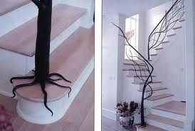
These tree railings are a natural touch to bring the outdoors in.  They create an organic feel instead of having a chunky railing that doesn't lend much to the decor of the room.  So many options are available.  Look around and see what you can find, or better yet, use your imagination!

Sunday, February 20, 2011

Fun Aquariums

I came across some cool ideas for aquariums recently, so I thought I would share some.  It just goes to show you that you don't have to have a typical rectangular aquarium in a room, it can be a part of the design. 
This is a bathroom sink that is an aquarium.  This sink would be a fantastic addition to any bathroom, especially one with an underwater theme.  Can you imagine the conversation piece this could become if you put it in a guest bathroom?!  This would go very well in my dolphin themed bathroom!
A perfect match for the aquarium bathroom sink is the aquarium tank on the toilet!  That tank is much nicer looking than a typical porcelain ones we normally see.  This piece would definitely add some interest to a normally invisible item in the bathroom.
This table would be a great idea for a casual seafood restaurant.  Maybe a lower version with some chairs instead of stools and it could be put in a nicer restaurant.  This would be a step away from the typical lobster tank at eye level that is seen at a lot of seafood restaurants now. 
Any piece of furniture can be converted to an aquarium, including an old computer monitor!  This aquarium is becoming very popular.  They call it an imacquarium.  What a cool way to re-purpose something that we would normally throw away.  I will keep these unique aquariums in my arsenal for my clients that request an aquarium to add a little pizazz. 

Thursday, February 17, 2011

Think Summer

This week I, once again, got my inspiration from The Family Handyman magazine.  This month they have a patio pergola as their do-it-yourself project.  Here in Texas, the majority of the time, we spend a lot of time outside.  In the summer months it is harder to do that with the sun beating down on us.  A pergola is a great way to give partial shade to an area without cutting the beautiful sunshine completely.  With a pergola, vines could be coaxed to climb it to provide a more natural environment that blends more into the outdoors.  Adding to our living space by creating a usable outdoor area is a great way to enjoy the normally fabulous weather that Texas offers.

Tuesday, February 8, 2011

Camouflage Televisions

I was at Michael's this week getting a piece of my artwork matted in the custom frame shop.  While I was standing there waiting a small flyer caught my eye.  It was how to use a custom frame to put around your flat screen television.  I have seen this done on the decorating shows on the television before but never really looked into it.  So I decided to do a little research to find out more. 
This frame is one example of a custom frame from Michael's.  I found a website called http://framemytv.com/?.  This site has so many more ideas than just putting a frame around the television to disguise it.  Artwork that moves out of the way when you turn the television on is one example.  Another choice is to have a mirror where the television is when it is off, with this nothing moves, the glass is a special kind of glass that allows the picture to show through with no distortion when the television is on. 
This artwork is one of the choices that is offered on http://framemytv.com/?.  An artist can use their own artwork instead if they can make a digital copy of it.  A family portrait could also be used, for example, with the photographer's written permission.  With the technology of flat screen televisions and this unique way to camouflage them the ugly television no longer has to be the focal point of the room.  The television can be hidden away and a beautiful piece of artwork takes its place until the television turns on. 

Kitchen organization ideas

This week...after the roads cleared up...I headed to Home Depot to check out the kitchen cabinets.  A well organized kitchen is necessary for us to be able to function well and safely while preparing our meals.  I spoke with the person in the kitchen department and asked about any new kitchen organization that was available for cabinets.  She gave me a Thomasville catalog that is strictly devoted to cabinet organization units.  She also said that http://www.rev-a-shelf.com/ is THE place to go to get organization ideas, not just for the kitchen but for closets, bathrooms, anywhere you can think of. 
This Lazy Susan is one example of a way to organize things more efficiently in a cabinet.  This type of shelf swings out to allow easy access to an otherwise hard to get to cabinet.  Notice that the door folds out of the way too.  No more having a cabinet that you can't use because you can't reach into it easily.  Lazy Susans come in different finishes and materials depending on your cabinets. 
This cabinet has a door that pulls out with shelves attached to it.  Shelves like this are much more convenient instead of multiply drawers or doors to look through.  Easy access is available from two sides.  Organization would be much easier with these shelves.  The shelves are as deep as your cabinets and can be custom made to whatever width you choose. 
Pull out shelves in a bottom cabinet allow for easier access.  Instead of having to bend way down to see what is in your cabinet just pull out the shelf.  This idea would also work well in a Universal Design to allow easier access for someone in a wheelchair.  These shelves are as deep as your cabinets.  You can custom order them to the width of your choice.
I thought these small shelves mounted on the inside of a door would be a great idea to replace a spice rack.  Spice racks take up counter space, this way you could save your valuable counter space for some kind of neat kitchen gadget.  These shelves would also be good for small items that tend to disappear in the big cabinet.  These ideas are just a few that Home Depot had on display.  Check out the website I suggested for many more ideas.  Organize your kitchen so you can enjoy creating in it. 

Tuesday, February 1, 2011

Simply Color

This week I was introduced to a fun restaurant.  The name of it is Zoe's Kitchen.  The architecture of the restaurant is very simple.  They use geometric shapes and lots of bright color.  The ceiling is left open to all of the duct work which gives the restaurant a casual industrial look. 
The colors are very bright and energetic.  Stripes of varying sizes are on the walls.  Oranges, reds, greens, and blues are used to add fun and interest to the restaurant.  Below the stripes shown in the picture above is a spot where local schools can put up their artwork.  Zoe's Kitchen then sells the artwork and the money that is raised is given to the charity of the school's choice.  What a fun way to give back to the community. 

This is one of the lighting fixtures in the restaurant.  Simple repetitive globes hanging from a cylinder but so interesting.  An orange color is on the cylinder to pull some of the color off the walls onto the ceiling.  Use bold energetic colors in your home.  Make it yours.  Do what you like. 
Until next week...

Sunday, January 23, 2011

Internet Inspiration

This week I was searching the internet looking for some new interior design ideas.  I came across a site called designshuffle.com.  It had a bunch of pictures on it.  One in particular caught my eye.  The Anemon Bistro is not the usual style that I like, but it was very interesting. 

This is a picture of the exterior.  It would definitely catch your eye as you walk by.  It does not have the typical rectangular windows.  It has different sized circles along with very organic shapes that create interest.  I believe this would get people interested and possibly bring in customers. 
This view is from the main entrance as you walk into Anemon Bistro.  It has a futuristic feel to it for me.  The color palette is very limited, white, black, and gray with accents of neon purple.  The organic shapes from the windows are carried through the interior as well. 
This view is of the bar, stairs, and a table and chairs.  The reflective surfaces throughout the interior reflect the purple neon accents throughout the bistro.  The stairs are a unique shape without a closed in riser which allows for a more open feeling and not having the view obstructed as much from one side of the bistro to the other. 
This design is completely out of my comfort zone, but reminds me that I need to keep an open mind and realize that there are so many different directions that design has.  From rustic to futuristic, there is no telling where a project could take me.
Until next week...

Saturday, January 15, 2011

Inspiration to get Organized

I'm back, and I will be blogging every week during this quarter again.  This week, I decided to share some great ideas I got from my husband's The Family Handyman magazine.  Getting organized is a popular New Year's resolution, so I thought I would share a few ideas that can help.
This first idea is an inexpensive way to get rid of belts cluttering up drawers.  Organization is a great way to keep a room looking well designed.  A wooden hanger with some small hooks screwed into it to hang the belts on solved the problem of where to put your belts.  
 Setting up a garage or workshop can be very challenging.  It has to be organized, but functional.  Things need to be readily accessible without having to search through drawers and cabinets.  This idea is a very inexpensive way to solve the endless screws, washers, and other little things that end up in the bottom of a drawer problem. Small craft bags with a hole punched in them can be hung on a peg board in a shop for easy access without having to dig through drawers to find what you need. 
With a little imagination we can solve a lot of our clutter problems.  Having an organized home can lead us to be more productive and more content.  Have fun and use your imagination. 

Thursday, December 16, 2010

Magazines that Inspire

This week I am going to share three magazines that inspire me.  These magazines help me come up with new ideas and also unique ways of using everyday items in new ways.  A couple of them are more for the do-it-yourselfer (which I am), and the other one is a leading design magazine.  They all have good qualities and show interesting new things on the market.  A new weekend project is never further away than the next month's issue.
The first magazine is one my mom introduced me to.  I love this magazine.  It is called My Home My Style.  This magazine is filled with do-it-yourself projects and decorating ideas.  They usually have a fun way of using everyday items to store things.  They also have money saving ideas for home decor.
One that my husband has a subscription to is called Family Handyman.  This magazine is wonderful for a new weekend project for the do-it-yourselfer in all of us.  Every issue has a project that can be completed in a weekend.  I have seen unique storage ideas to traditional bookcases and everything in between.  Complete directions accompany each project so the project moves along smoothly.  This magazine has been a big help in our home.  They even offer money saving ideas for water and electricity.
Dwell magazine is one I found doing research for this blog.  I haven't had much experience with it yet.  It looks like it is packed with new ideas and even has an events calendar which is really cool.  It has new products and pictures to inspire you to create.  People is another section in the magazine which keeps you informed of the designers that are keeping the industry interesting.
Thanks for following my blogs throughout the quarter.  Hope you enjoyed sharing my inspiration.  I hope some of these things sparked some inspiration in you too.  I have come up with so many new ideas.  Don't be afraid to create, you may come up with the next "new thing." 

Tuesday, December 7, 2010

Furniture that Inspires

This week I had to find furniture that inspires me.  I found two pieces that I thought I'd share with you.  The first piece is a bookshelf, but get this...it's made out of cardboard!  The bookshelf is also a unique shape and could add some pizazz to any room.  Since it is cardboard it is recyclable and it's cheap!  I love the shape of this bookshelf.  Much more interesting than the traditional bookshelf.
The other piece I found is not in production yet, but I thought it would be really cool to have.  It is a chair that has all of our "can't live without" media in the chair!  It has a TV, computer, and spots for all of our gadgets to tuck away in a really modern design.  What person wouldn't like to have this as "their chair?"  I love the shape of this chair and the multi-functionality of it. 

Next week...Magazines that Inspire...

Project Spotlight

I found this project on a blog on the internet.  This staircase was all wood before the start of the project.  The person decided the stairs needed some sprucing up.  Normally, when people carpet stairs they do all of the stairs, rise and run.  This person decided they only wanted to do the rise part of the stairs in carpet.  The result is genius in my opinion.  It adds a lot of interest to the space without being overly done.  The pattern is interesting and makes for a beautiful space without taking away from room.  This idea definitely added to the room and made it personal. 

Wednesday, December 1, 2010

Inspirational Design

This week I need to share a design for a space that inspires me.  I decided to use Tillman's Roadhouse in Fort Worth as my inspiration.  Our class had the pleasure of going there on a field trip and it was absolutely fabulous.  I have always loved designs on the rustic side, but prefer a modern touch to it.  I have not seen this combination before.  Tillman's combines these two styles perfectly.  There is an outdoor seating area and also an inside seating area for dining and a bar.  The entrance to the restaurant is also part of the design.  The cut log wall that guides you into the restaurant is the divider wall that cuts off the outside seating area from the entrance.  The door handles are shotguns.  Very rustic.
The cut log design continues inside on the bar and also above the bar.  The stools for the bar have a more modern touch.  While the couch near the bar adds an eclectic touch and a pop of color, with peacock blue. 
The chandeliers add elegance while the pine on the walls keeps the rustic feel alive.
 This restaurant has rustic charm, with a touch of elegance.  It is very much my style and my inspiration for this week.  Next week...Furniture That Inspires.

Wednesday, November 24, 2010

Coffee House Research

This week I had to do a site visit to a Coffee House to do some research for a project I am working on.  I had to watch how the customers and employees move through the space, how the layout and finishes work, and what kind of customers come in.  I went to visit a Starbuck's on Sunday afternoon.  There were a few customers that went through the drive-thru in the time I was there, but the majority of people came in to get their drinks.  The customers would come in, go directly to the counter, order their drink, and then mill around looking at the various gift ideas since it is the Christmas season.  There was a couple that came in and sat on the comfy chairs to chat while waiting for their drinks. 

The employees were very cheerful and took care of the customers immediately.  I never saw a line form, or saw a customer have to wait more than a minute or two for their drink.  I did not see anyone buy any of the food items that they offer.  The employees seemed to have little areas that were their own that they pretty much stayed in which kept them from getting in each others way.  Occasionally one of the employees would have to go in the back room for something, I noticed it was always the same employee.  That was also the same employee that was working closest to that door while he was behind the counter.  They seemed very efficient.  The store is kind of skinny and long which made the tables at the front to sit at seem kind of crowded together.  There were two comfy chairs placed near the counter that were a nice touch.  The gift section was set up in a way that was easy to view while standing waiting for your order. 
I noticed that there is a wide variety of people that come in to the store at any time.  While I was there there was a young family with a child that came in, young couples, a young mother with a baby, and a student that set up a little study area complete with her laptop.  There was also a small group of friends that came in together, an older woman, a mother and daughter, and an older man that possibly had come from church and sat down to read the Sunday paper.  The vast majority of people came in, got their drink, and left. 

The neutral color of the walls creates a blank canvas for whatever they want to do in the store.  The dark wood tones of the shelves the gifts are on stands out from the neutral walls very well.  It catches your attention.  The different wood tones of the counter add some interest to the space.  The dark tile floors add a nice contrast while creating a space that is easier to keep looking nice in a high traffic area.  The dark green chairs add a nice pop of color to a neutral palette while not being a bold statement.  They also had very minimal Christmas decorations near the gift items which reminded the customers of their shopping lists.  There are also some tables outside for customers when weather permits.  I know I will be making another visit on Black Friday early in the morning!   
Next week...Inspirational Design

Wednesday, November 17, 2010

A Design I Think could have been Better

This week I was supposed to find a design I think could have been done better and why.  I actually chose an outdoor space for this.  To me I think the surrounding area of a building is just as important as the interior.  At my campus there is a beautiful area with a waterfall.  You can hear the water and it is very peaceful.  The area is surrounded by trees and plants but there is no benches or a picnic table there.  I think that is the perfect spot for a couple of benches to be able to sit and relax between classes, or even sketch. 

This is the waterfall.

This is the planted area directly in front of the waterfall where I think some benches and maybe a picnic table should be.
 This is a view from the waterfall across the planted area, across the parking lot to some benches.  I think that is part of a smoking area, which is fine that they have benches, but I think that a perfect opportunity for a nice quiet place to sit for non smokers was missed here. 

Wednesday, November 10, 2010

What has inspired me this week?

This week I had the pleasure of being able to visit an amazing piece of architecture in Fort Worth.  The Marty Leonard Chapel.  Every aspect of this design was part of the building.  From the walk up to the chapel to the entry, to the garbage cans.  Everything having to do with this chapel was well thought out in the design.


The chapel diamond shaped designs run throughout all aspects of the building.  I wish we could have stayed longer to watch as the sunset changed the way the light played coming through the windows.

The benches outside the chapel on the walkway and the lights along the walkway are all part of the grand design.

 The planters and stools inside the chapel were designed along with the building as well.  To think about every little detail while designing this amazing piece of architecture is just mind blowing.  There was so much planning and thought that went into this design.  I am inspired to think outside the box, and try to think of the big picture when planning my designs after visiting this wonderful chapel.
Next week...a design I think could have been better...

Thursday, November 4, 2010

Career Spotlight

I have chosen to write my blog on a career in historic preservation today.  Historic preservation is a very important career.  So many older buildings have such a deep history that they shouldn't have to die of old age.  Some people renovate and destroy the original splendor of the building.  I would like to have be able to bring back the glory of historic buildings that have become run down.  My grandmother's church just underwent a full interior renovation. 


They didn't change the look of the church.  They gave it a fresh coat of paint.  They repainted the murals on the ceiling.  They refinished the pews.  There was no need to change the church, it just needed to be freshened up.

This is the kind of work I would be proud to do.  Next week...what inspired me this week?

Thursday, October 28, 2010

Residential Inspiration

This week's blog is about residential inspiration.  I have always been intrigued by the magnificent historic homes here in Weatherford.  I took this opportunity to go on the Historic Residential Driving Tour in Weatherford Texas.  A Historic Downtown Walking Tour is also available.  Around Christmas every year they also do a candlelight tour.  This year it is on the second Saturday in December. 


The first house that caught my attention on the tour is the R. W. Kindel Home that was built in 1881.  It is a Texas Historic Landmark.  This house has always caught my attention, but I didn't know the history.  I had always joked about how it would make a great haunted house for a movie.  So, I thought since it was almost Halloween it would be fun to show it here.  Mr. Kindel was a local druggist for 60 years and owned a castor oil business in Weatherford.  It is the same style, Neo-Renaissance, as the courthouse in Weatherford.  It is limestone with a copper roof.  It has square porch columns and 20" thick walls. 
The other house on the tour I would like to showcase is the C. D. Hartnett Home built in 1896.  It is now Angel's Nest Bed and Breakfast Inn.  C. D. Hartnett founded Hartnett Wholesale Grocery Company, still in operation today in Weatherford.  It is a 10,000 square foot mansion with a turret from the first to the third floor, a wrap around porch, and a wine cellar. 
I would love the opportunity to restore a historic home to its original glory someday.  Don't miss out on seeing these historic homes.  I was told that the interiors can be viewed during the candlelight tour in December.  Here is the website for more information Parker County Heritage Society.  Next week...career spotlight.